When teams ask how to improve landing page conversion rates fast, they’re chasing the promise of immediate returns that change a company’s path overnight. A landing page stands between a potential customer and your business, measuring the split-second spark when visitors decide to act or bounce away. Low conversions burn ad budgets and stall pipeline growth.
A sluggish strategy means rivals pocket the sale while you analyze last month’s data. Actionable changes—think sharper calls to action, speedier load times, and focused design tweaks—can boost conversion rates over a single campaign. Fast iteration shrinks testing cycles.
Three reasons fast improvement changes outcomes:
Revenue climbs with each percent gained.
Lower acquisition cost means more room for reinvestment.
Better experience builds brand trust and retention.
A single improved form or headline twist can edge conversion rates up before the next quarterly review. For companies with tight margins and tough competition, rapid tweaks to landing pages have compounding effects, making conversion strategy an urgent priority for 2026. Speed separates winners from laggards.
The main points
Software tool integrations for landing page conversion optimization
Rapid iteration frameworks for fast conversion improvements
Fast-Acting Tactics to Boost Conversion Performance
Don’t wait for quarters to pass. Get your landing page clicking right now. Not everything takes a full overhaul—quick changes can pile up into wins, if you’re sharp about where you attack first. For teams watching signups, demos, or the thermals on a sales funnel, a single tweak can show up in Stripe before lunch. The team sees numbers jump, competing platforms lights up, and everyone wants more. Choosing the right starting line means you don’t burn cycles guessing or get stuck grinding for a gain that never arrives.
These are the speediest moves you’ll see pay off on a standard SaaS page or a lean marketing site. The tactics draw straight from what 2026’s hard-nosed conversion analysts and SaaS growth hands are shipping (for the most part). These aren’t theory; they’re what benchmarks track—moves that show up in industry reports, not boardroom daydreams.
Tactic
Description
Est.
Simplify Page Copy
Hack out thick paragraphs—swap in punchy headlines, slice the jargon, keep it quick.
1–2 hours
Improve Call-to-Action
Change CTA button: color, words, or where it sits. Make it impossible to miss.
1–2 hours
Add Social Proof
Drop in logos from paying customers, or real reviews.
2–4 hours
Reduce Form Fields
Kill every signup field that doesn’t pull weight. Only the must-haves—name and email.
2–3 hours
Activate Live Chat
Flip live chat on—automated if you must, a real person if you can.
1–2 days
Launch A/B Test
Spin up a variant—headline, button, or hero image. Track who clicks, and who walks.
1 day
Speed Up Page Load
Crush file sizes, lean on a CDN, and rip out slow scripts. Under 2 seconds or bust.
1–2 days
Schedule live chat and testing for after lunch, or end of week if you want automation. One morning sprint—copy, CTA, proof—gets you most of the way (at least usually). Ten percent lift is common here, sometimes twenty. These are SaaS norms. Rapid trial and small edits outpace “we’ll improve next quarter” every single time. Statista data from 2026 backs it—plain-text tweaks beat lethargic enterprise rollouts, multiply that when you wire in modern site tools that sync to analytics and your CRM.
You want fast truth about conversion rates? Clarity compounds, action snowballs, and the ARR graph inches upward—strange, but it happens. Try something right now, see what jumps, then double down when you spot traction. A tweak in the headline triggers more demos. Strip a field, signups tick higher.
Improve Your Headlines for Clarity and Value
The best headlines strip away fluff, grab attention with value, and tell the reader exactly what’s in it for them. A headline does more than announce—it dictates whether a visitor sticks around or vanishes in three seconds flat (for the most part). Weak, vague phrasing like “Welcome to Our Platform” gets ignored. Simple, specific promises—like ‘Save 8 Hours A Week With Smarter Email Automation’—offer instant clarity that holds your audience. That’s the engine room for higher conversions.
Headlines overloaded with jargon or clever wordplay often confuse instead of convert, draining your page of momentum. Clarity wins every single time. To rewrite a headline for stronger engagement, start by slashing the words to only what’s necessary, then find the single most valuable benefit your visitor cares about. Leading with that benefit makes your offer pop. If you want to see how to improve landing page conversion rates fast, this is the most used starting point.
Here’s how to create headline options that go beyond guesswork:
Write down your current headline, then underline the main promise hiding inside it.
Rewrite that headline three ways—one that focuses on a pain point, one on a direct benefit, and one using social proof (“Trusted by 1,500 teams”).
Cut unneeded filler from each rewrite—focus on clarity and specificity.
Plug these headline variants into your landing page as separate A/B test versions.
Run the traffic split for a week or two, measuring which headline gets the most clicks or form fills.
One variant might massively outpull the rest, giving you a fast, data-backed gain. A/B testing is the field lab for headline messaging. Each headline should be clear within three seconds of reading—which matters even more on mobile, where space and attention are at a premium. Readers swipe past clutter, but a crystal-clear value pops even on a crowded phone screen. Speed of learning beats cleverness.
Even top SaaS companies regularly refresh their headlines, using continuous headline split tests as part of their rapid iteration frameworks. They measure micro-metrics—the click-through on a hero button under each headline, heat-maps tracking eye movement, and scroll depth. Every winning test version gets rolled out to more visitors — a core tactic in the playbook for anyone obsessed with how to improve landing page conversion rates fast.
What Is Landing Page Conversion Rate?
Use phrases pulled from reviews or support chats, because those reflect the language your audience actually uses and trusts. One more tip: borrow from your customers’ own words. Clarity and authentic value match what people are already thinking. Treat your headline as a living experiment, not a set-and-forget label. Put each version to the test, lean on real numbers, and let the data shape your message. That’s how lasting conversion insight is made.
For evidence on headline test impact, a 2025 case study on CXL’s headline experiments showed boosts of up to 37% in sign-up conversions by reframing generic headlines into value-packed statements. That’s use you can bank on. Sharpen headline clarity, test, and watch the conversion numbers follow.
Upgrade and Test Your Call-to-Action (CTA)
They don’t pull anyone’s attention, so visitors drift off. Plenty of CTAs just sit there. Landing pages that actually convert people have CTAs that jump out, force a pause, and point a giant arrow toward the next move—one direction, no detours. One word, the wrong color, even a lazy “submit” can slacken a button’s grip or choke its performance altogether.
Orange can light up white backgrounds. Swapping a button’s color can pivot your results fast—you might double taps by sundown or lose half before breakfast. Green wins clicks on SaaS landing pages—think “go” at a traffic light (in practice). It yells, but it’s a different animal: it energizes action, but also carves a note of warning, so you can’t coast on instinct; always split-test, because there’s no magic, can’t-miss shade for every project. A garish button, all neon and noise, will make a user bail faster than a 404 error. Signal blue—enough juice to catch the jumpy ones. Shoot both colors against real visitors and collect numbers in your A/B testing platform before locking in a winner.
Nobody likes a muddled shop window. On a big monitor, eyes bounce diagonally, left to right—so test your landing spots where mouse and gaze naturally drift. Only one main CTA per page—if there’s even a whiff of competition, you muddy the mission and see drop-off. Never stick your only button way down in the gutter where people won’t bother scrolling. Sometimes the answer is to just park it, big and obvious, right in the center. Mobile needs special care—make that CTA easy to tap without stretching, somewhere around the bottom third, where thumbs can roam free.
If you settle for “Click Here” or “Submit”, your CTA vanishes into wallpaper. Words do the heavy lifting. Swap them for language dripping with benefit and immediacy—“Start Your Free Trial Now,” “Open up My Demo Instantly,” “Get My Savings.” That last one moves the needle for personal finance offers. Urgency isn’t magic, but it works if you actually mean it (real deadlines only). “Claim My Discount Before Midnight”—only if you’ll close the cart. “Secure My Spot Today.” If you fake scarcity, trust melts away.
Here’s how to tune up weak CTAs:
How To Calculate Landing Page Conversion Rate
Pick two or three wild-card button colors and pitch them head-to-head with real visitors.
Go for hungry, first-person copy loaded with benefit—it’s “Get My Offer,” not “Submit.”
Before launching, hack away secondary links or shiny distractions near the main button.
Main CTA should squat above the fold everywhere—on mobile, seed it at every scroll break so nobody gets lost.
If you play with urgency, tie it to something tangible; test “last chance” lines when you can back them up.
Sometimes you shovel sand, sometimes you move mountains. A CTA that’s shaped and sharpened with care can boost conversions in a week—sometimes overnight. Button shade, copy tweak, urgency phrasing—they’re levers, not window dressing, when you shape each one based on what users actually do. That’s how you stack real gains, not just guesses. If you want the full gospel on mobile-first usability for CTAs, check out the Nielsen Norman Group’s mobile UX proven methods. They’ve mapped the hard ground already.
Remove Friction—Speed Up and Simplify Forms
Clunky lead-capture forms and landing page slowdowns cost real money in 2026. Every extra field in a registration form is a point where people drop off, hesitate, or bail to a competitor’s snappier page. Reducing friction is a conversion power move. It works across SaaS, e-commerce, and service industries. Fewer fields, fewer bailouts.
Asking for a phone number, business size, or even last name almost always hits response rates. Most teams sabotage their results by burying leads in unnecessary questions. Name and email, in one field each, covers nearly all rapid-response use cases. Birthdates, physical addresses, or marketing checkboxes can live further down the customer journey, never in the clutch moment. Go straight to the point.
Start with these three actions to flatten the path to submission:
Cut your form down to bare minimum fields—name and email are usually enough for the first conversion point.
Enable browser and device autofill, both for desktop and mobile users, so repeat information is already entered when visitors return.
Skip optional checkboxes, CAPTCHAs, or inline marketing opt-ins until after you’ve collected the email and locked in the lead.
Tools like Google Autofill and Apple Keychain recognize standard fields, but only if you code them directly and keep naming conventions clean. Avoid custom field names like “first”, which break those systems (give or take).
Google’s 2026 Core Web Vitals set the minimum: a landing page that loads in under two seconds converts at majorly higher rates (as a rule). Page load speed counts as friction, too. Anything slower causes pileups in the sales funnel. Use compressed images, asynchronous scripts, and a light mobile CSS package. Screen size should trigger mobile-improved forms, never just a shrunken-down desktop grid. Form fields on mobile should be big enough for fat thumbs, not designed for a mouse.
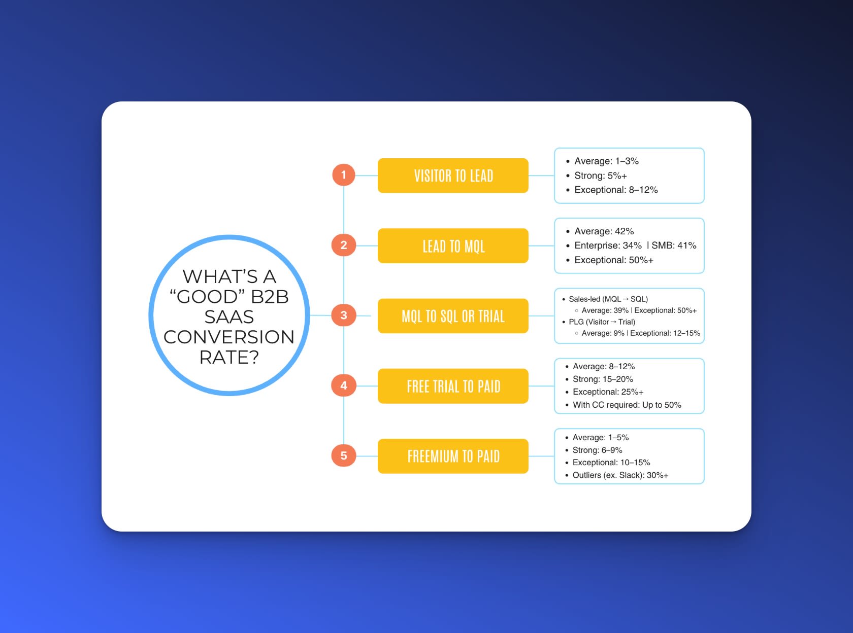
Benchmark Conversion Rates: SaaS vs. Other Industries
A ZIP code field that triggers the right numeric keypad, or an email field that brings up “@” and “.com” in the keyboard, can speed things up when seconds count. On mobile, keyboard triggers make or break the experience. Stack fields vertically and use high-contrast labels for accessibility. That’s not fluff—it closes more sales.
Speed and friction aren’t just “nice-to-have” details. They drive substantial lifts in conversion and dramatically improve campaign ROI. Modern SaaS benchmarks consistently show that pages with autofill, three fields or fewer, and sub-two-second load times outperform clunkier funnel competitors by wide margins. That’s the edge sought by growth teams focused on how to improve landing page conversion rates fast, especially in crowded B2B and fast-cycle B2C sales. Even on pages with generous traffic, trimming load time by half a second or shaving a single unnecessary field provides outsized returns compared to pouring budget into more ads. For industry data and in-depth benchmarks, see the latest Think with Google mobile speed benchmarks on conversion performance.
Instant, frictionless forms close the deal before competitors get their first click (more or less). Sweat every input, loader, and device tap.
Add Fast-Acting Social Proof and Trust Elements
People jump to decisions. You’ve got seconds—maybe five—before an unsure visitor decides to click away. They poke around for signs anyone else trusts you. Trust badges and social proof break hesitation. They don’t just decorate the page; they chop down skepticism, speeding up those key moments when doubt slides in.
Static review snippets do, too. A testimonial carousel sits right at the top. Big names, real job titles, clear company logos—all above the fold. See what happens when you swap a block of product claims for a short, sharp endorsement from someone customers recognize: demo requests creep up. Two lines from a famous user can eclipse ten paragraphs. If a review hits their pain point and rings honest, you snag buy-in. That shortcut is visible in your next split test. Sometimes the uptick registers in under a day.
Skip mushy praise and use details.
Drop two or three testimonials right above the main call-to-action button. Here’s how you launch trust elements fast:
Pull quotes from users who match your target buyer. Faces out front, company names obvious.
Line up familiar customer logos in a single row. If things get noisy, swap color for grayscale—but never plug in fakes.
Plant trust badges where the conversion happens. “As Seen In” media flashes. Don’t tuck them in the footer, lost and gathering dust.
Tie at least one review to a real, verified authority link. External validation backs up your claims.
Mental clutter lowers as visitors see proof and decide to finish the form or hit “Start Now.” A simple Trustpilot or G2 widget pins real testimonials onto your page without long dev cycles. Once it’s live, track changes—quick split tests show results in days. Don’t wait for red tape.
Customers tilt heavily toward signals from people like themselves. Behavioral science backs this up. Social proof, badges, media mentions—all these pieces feed borrowed certainty, letting your product ride on trust until your reputation builds. In SaaS and e-commerce, competition turns tight. Every extra badge trims the decision cycle further, especially if it pops before a visitor has even scrolled. Three quick logos plus one carousel? That’s a cheap, fast lift for your completion rate. Stack this tactic with rapid A/B testing and you’ll iterate faster—authority lands, conversion graphs climb, you catch what actually moves your funnel.
Top Proven Tactics to Improve Landing Page Conversion Rates Quickly
Statista’s 2026 rundown on online reviews’ influence cuts through the hype. That dataset ties every step here to hard evidence, showing trust tweaks aren’t just surface polish. Trust elements turn into fuel—real data, real conversion jumps, and zero fluff.
That’s the kind of trust you can measure.
Conversion Success: The main points and Ongoing Optimization
Bold steps overhaul a landing page. One goal, clear as glass. Fast beats fancy the whole way to higher conversions. If you crave results, you don’t chase clever copy or brilliant design flourishes—just rummage for what cuts confusion and yanks the visitor toward action.
Name a single goal and ruthlessly delete everything else.
Hammer at your headlines, your button text, your main offer—scrub till no one could possibly mix up what’s next.
Drop real testimonials and trust stamps right at the top—eyeballs hit these first.
Target your headline, your main picture, your call-to-action—don’t waste time on button color theory yet.
Images should load in a blink, not a yawn. Strip extra code; resize everything for mobile.
Get analytics or a purpose-built landing page platform—if you can’t measure it now, you fly blind.
You don’t stop with the first draft. Then do it again—quick, every week. Broken tests aren’t a setback. Every flop teaches you something. The playbook for How to Improve Landing Page Conversion Rates Fast isn’t a one-time blast—it grows with you. Put reviews on your calendar. Watch numbers dance on your SaaS dashboard, or stack up against cold benchmarks. Record every test, even the ugly ducks. Stockpile the winners for future launches—don’t trust memory. Tap sales and support for raw feedback and thread what you learn back into the funnel. Consistent tweaks, measured changes, and tight feedback cycles grind out real growth. You’ll tire yourself chasing magic fixes, but teams who build a habit of messy, repeatable experiments—and lean on clean data—blow right past the lone-wolf “brilliant” campaigners. High performers in 2026? For proof, or a reality check, check Statista’s landing page benchmarks—see exactly where you land against the pack.
Fast Conversion FAQ for Landing Pages
Timeframe for Seeing Conversion Improvements
Teams usually spot conversion lifts fast—sometimes only days after pushing new landing page tweaks. A headline switch or a fresh button can ripple through your numbers by the next day if that page sees real traffic. It rarely stops there, though; as user sessions stack up, the improvement curve keeps bending upward.
Top Metrics to Track When Improving
You can’t skip conversion rate. Bounce rate’s next—watch the needle any time you launch a new version. Average session duration lands third. These three, across every landing page. Dig deeper: cost per conversion sometimes blows out your budget, and scroll depth reveals where users bail. Get sharp analytics, then you won’t waste time chasing ghosts.
Typical Costs for Rapid Landing Page Optimization
In 2026, you’ll find split testing tools starting at $29 a month—that’s for the plain stuff. Platforms with serious gear like multivariate testing or heatmaps start stacking fees fast, vaulting into a couple hundred dollars if you want every bell and whistle. Plenty of vendors offer a free small-site tier, but if you run scale, those bills come due.
Proven methods for Improving Mobile Conversion Rates
Mobile wins are all about speed and clarity. Shorten the form fields until you can’t cut any further. A one-second delay on load will keep leads stranded in the queue. Drop redundant copy, slap primary actions right above the fold, and check your tap targets—never crowd a button so a thumb misses. Teams running polished mobile UX see conversion rates double inside a week.
Priorities When Using Iteration Frameworks
Test only one idea at a time: isolate a headline, a button color, a short burst of copy. Pull your sample, crunch the numbers, ship the best variant. You don’t sit idle for a monstrous sample size—just move. Every fast bet yields data, and more cycles means faster compounding wins on high-stakes landing pages.